Graphics
R is quite good at producing quality graphics. While making graphs in R from the command line is easy, HPC centers generally frown on using the login nodes for these tasks; however, as mentioned on the Setting Up R on Frontera page, there is a Visualization Portal that will run RStudio in your browser, which you can use for jobs suitable for running on one node. It is also possible to generate graphics on the cluster nodes and save the results, but this is often not an efficient way to produce graphics with R as creating a graph, especially a journal quality one, is often an iterative process; a better approach is to produce the plots locally, in an interactive session or on the Visualization Portal, perhaps on a subset of the data to achieve the correct formatting, and then run on compute nodes on the full data set if required, once the basic plotting parameters are tested. In many cases, however, a single node via the Visualization Portal or local machine will suffice.
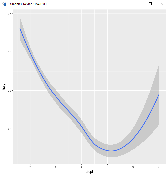
There are several ways in which graphical output can be produced in R; for two-dimensional plots, the package is a very popular one for the quick production of high-quality graphics. Here we give two examples from the excellent book R for Data Science (available free from the link given, or available for purchase in hard copy or digital format), using the data frame which comes with and which you can examine by typing into the console. To see these plots, we either need to be running Rstudio or R in console, locally, although if we have X11 forwarding set up it is possible to generate graphics remotely and display them locally, on your client machine. Note that if is not installed in your environment, you will need to install it with , which may take a while.

Using a different geom, we can get a smooth line based on the same points:
The sophisticated but easy-to-use package, and the grammar of graphics on which its interface is built, are detailed in "R for Data Science", linked above.
There is a detailed explanation of the standard graphics capabilities in the R user manual, starting on page 63 with the function. A quicker overview of plotting in R can be found linked from this page at Quick-R. Three-dimensional plotting can be achieved with from the package, or using one of several other packages, which you can search out on CRAN.
CVW material development is supported by NSF OAC awards 1854828, 2321040, 2323116 (UT Austin) and 2005506 (Indiana University)