Visualizing Tweets and Retweets
In this section you will learn how to use the matplotlib and pandas libraries to do some basic visualization of Twitter data. Recall that the original dataset was created using the Twitter Streaming API by searching on the hashtag 'climatechange'. Tweets were collected daily from November 20 to December 5, 2018, and saved to a file. After two weeks the files were combined into a single file. The resulting dataset contains more than 450,000 tweets.
The code described in this section is available to run in the associated Jupyter notebook on climatechange tweet timelines.
Having previously cleaned up the tweet data and saved it in a csv file, we can easily read it back in to a pandas dataframe, using the parse_dates option for pd.read_csv that was discussed in the page on "Extracting and Reorganizing Data".
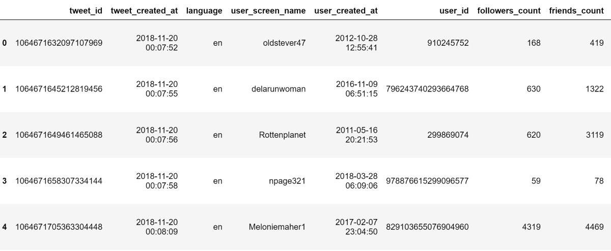
The first five rows of the dataset are shown below.
Overall Tweet Timeline
We're interested in how tweets and retweets unfold over time. Since each tweet is tweeted at a particular instant in time, it is useful to bundle tweets into regular time bins, for example, 5 minute epochs. We can accomplish this using the pandas groupby method on our tweet dataframe. Instead of grouping on identical key values as we did in an earlier section, we can use a pandas Grouper object to group timestamps into bins at the desired frequency and count up the number of entries in each bin, using the .size() aggregator function. Then we can plot the timeline.
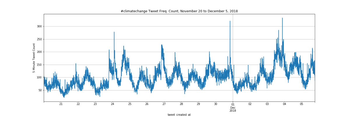
We can clearly see a daily cycle of increasing and decreasing activity over the two-week period. We can also see that activity can vary significantly from day to day, with sharp spikes of activity occurring on occasion.
Top 20 Retweets and Top 20 Retweeted
We're interested in the most-retweeted tweets and the most-retweeted users. We can use the Pandas groupby method again to count the number of retweets for each retweet_id and each retweet_user_screen_name, once again using the .size() aggregator. We can also chain a call to sort each of resulting Series object from large to small, easily allowing us to pick off the top 20 in each Series.
Plotting Timelines of the Top 20 Retweets
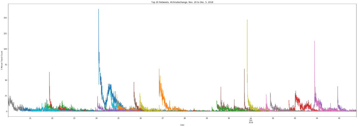
Next, we will use the same groupby method to get the timelines of the retweets associated with the top 20 most retweeted tweets, grouped once more into 5-minute bins. This should give us a better idea of the "life of a Tweet", i.e. how a tweet gets retweeted over time. In the code sample for this plot we show how to create a color palette using a python dict so we can easily set a custom color for each individual tweet timeline.
Cumulative Timelines of a Single Tweet
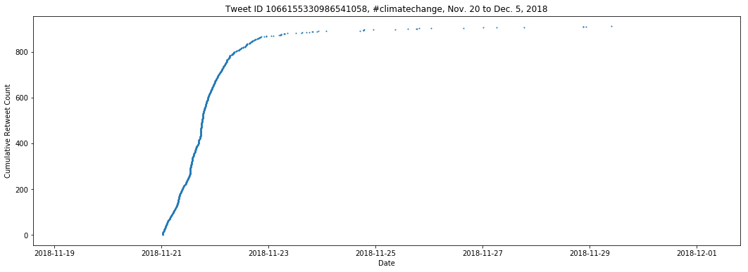
In this example, we will use a different approach to visualize the "life of a tweet". In this approach, we will not group the tweets into 5 minute 'bins' but rather plot each tweet in a scatter plot using the tweet timestamp for the x-axis and an incrmental count for each tweet on the y-axis. The top 20 retweets in the #climatechange dataset each consist of a few thousand tweets. This should be very manageable for matplotlib. We will see that, while this method offers additional insights into how a tweet gets retweeted over time, there are also limitations to this method and the process of revealing key details may require additional modifications to the visualization method.
An example of the resulting scatter plot is shown below:
Exercise: Cumulative Timelines of the Top 20 Retweets
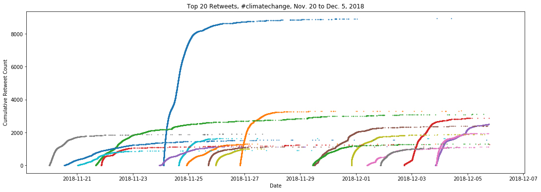
If you'd like to get some more hands-on exercise with visualizing this dataset, we leave it as an exercise to generate a plot consisting of the Top 20 retweeted tweets in a manner similar to the combined plot of tweet lifetimes in 5 minute bins. Proceed to the Tweets and Retweets Jupyter notebook in the code repository. and work through the exercise at the end. The plot should look like the figure below.
We can see that although a single tweet may or may not reveal interesting features, plotting multiple tweets together reveals interesting tweet dynamics which we cannot see with the previous approach. We see sharp points of inflection where a sudden high incidence of retweets occurs. What might be causing these? Some get retweeted quickly after the initial tweet and the cumulative profiles take off. Others linger for a while before becoming popular. Others more or less show a presence of retweets before their profiles finally saturate. Some of this variation could be coupled to the daily cycle, for example, due to reduced activity during the overnight in North America. However, there is still much to explore with this dataset. It would be great if we could interact with the plot, i.e. pan and zoom and select markers for more information. We'll revisit that question in Part 2 of this tutorial, where we consider more advanced visualization methods using Bokeh.
CVW material development is supported by NSF OAC awards 1854828, 2321040, 2323116 (UT Austin) and 2005506 (Indiana University)