Types of Visualizations
Let us review some of the basic principles of data visualization pertinent to this tutorial, as well as some common types of data visualizations.
Bar Chart
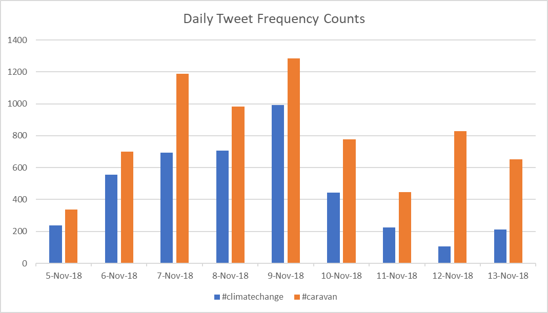
Bar charts are one of the most commonly-used data visualization tools because of their intuitiveness, especially when multiple variables are represented. However, too many variables or too much data can render bar charts useless.
Time Series Plot

Time series are another commonly-used data visualization tool. Data consisting of some time-dependent variable is plotted as a line. It doesn't get much simpler than that. The image shown above is a classic example of a time series, in this case of humidity collected every 10 minutes with a weather sensor somewhere in San Diego county.
Combined Time Series and Bar Chart
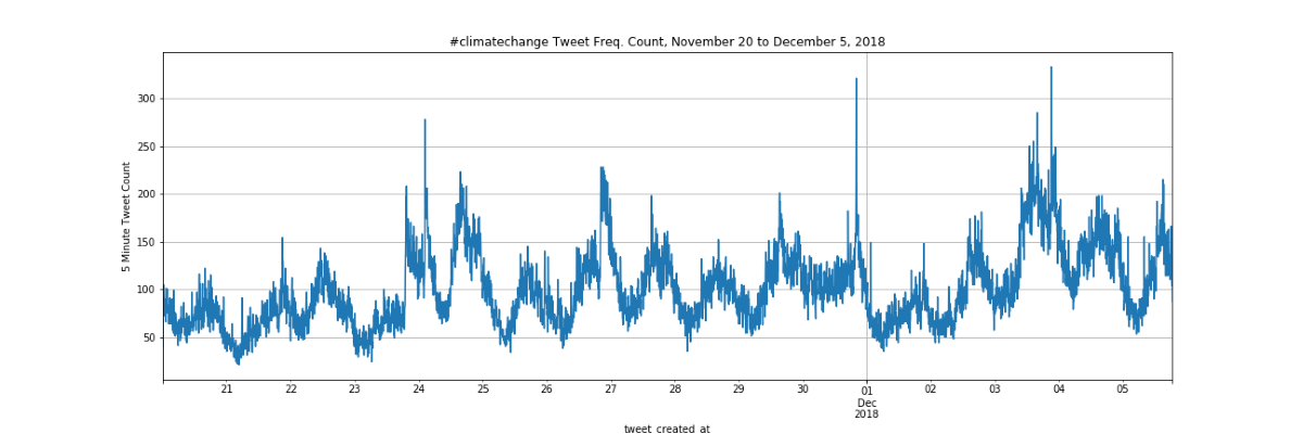
In these lessons, we use a variation on the bar chart and time series by combining them to create a temporal frequency count visualization by plotting tweet frequency counts for 5-minute intervals over the lifetime of the dataset and for the lifetime of an individual tweet. You will learn more about this in the section on Twitter Data Visualization with Pandas and matplotlib.
Scatter Plot
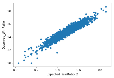
Scatter plots typically consist of two or more variables plotted as dots on an XY coordinate system. The data may or may not contain independent variables. The dots can be colored, scaled, varying transparency or geometry. In this tutorial we use scatter plots to visualize baseball data.
Scatter plot Grids
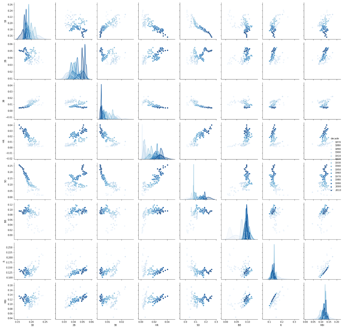
A scatter plot grid (or scatter plot matrix) takes advantage of the 'principle of small multiples' advocated by Edward Tufte. When the variables extend across a wide range of values, or when one or more of the variables are categorical, scatter plot grids give the viewer an array of small pairwise scatter plots which take advantage of our visual system's pattern recognition capabilities to identify relationships which may not be immediately apparent from a single scatter plot. In this tutorial we use scatter plot grids to visualize baseball data.
Heat Map
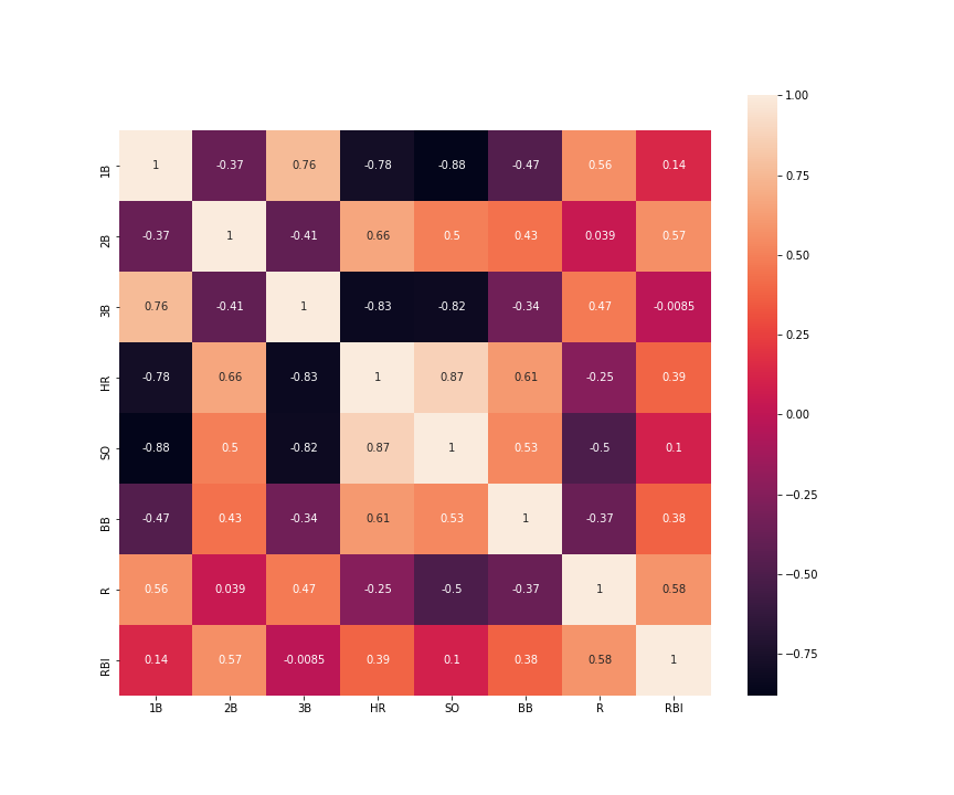
A heat map is an excellent way to get a 'snapshot' of a 2-dimensional array of data. The term 'heat' in this case is used more generally to refer to any kind of variation in a 2-dimensional array of cells in which each cell can be colored to represent the scalar value of that cell. In fact, this is now a feature of Excel spreadsheets. In this tutorial we use a heat map to visualize baseball data.
Network Visualization
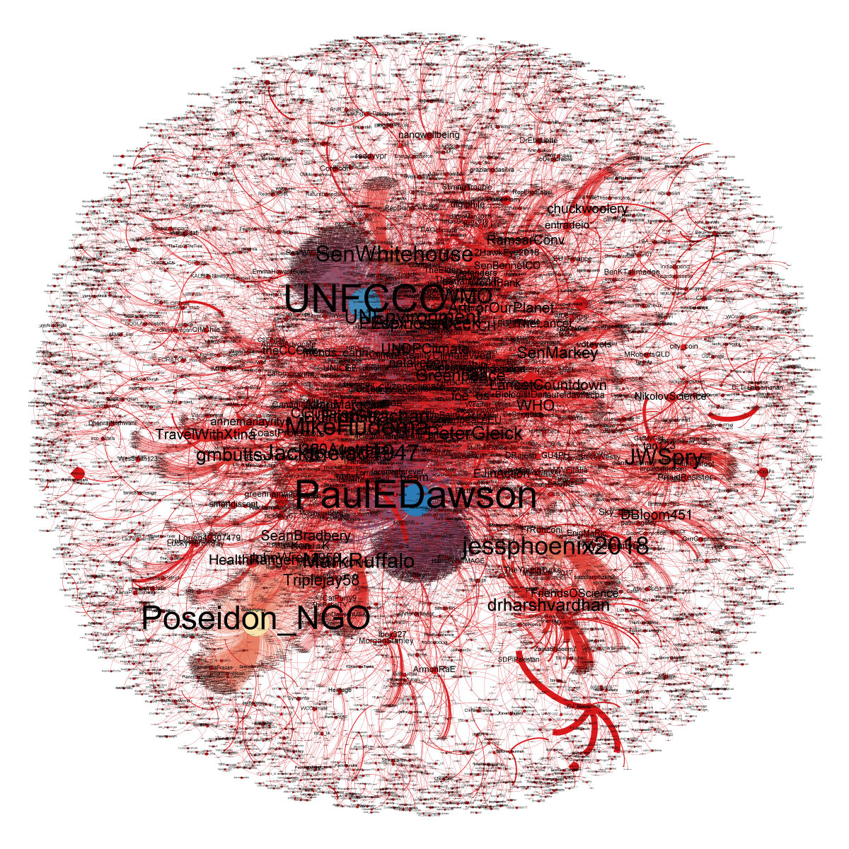
Networks, or graphs, are mathematical objects that encode connections or relationships among pairs of entities: the entities are the nodes of a graph, and the relationships are the edges connecting those nodes. Many mathematical operations have been defined to compute various properties of any specific network. In some cases, however, one is also interested in visualizing a network to get a better understanding of its structure. Network visualization is a complex problem, with many different possible approaches. Some networks are physically embedded in a two- or three-dimensional space, where nodes and edges have physical locations. A network of highways connecting different cities is one example, and the power network sending electricity between different power plants, transformers, etc., is another. Visualizing those networks is reasonably straightforward if you have information on all the positions of the nodes. But many networks live in some more abstract, higher-dimensional space, such as a social network like Twitter whose nodes reside in the space of all users. Network visualization techniques that project down from a large number of dimensions to render a picture in 2 or 3 dimensions are non-unique, and can be devised to achieve a variety of different goals. Done poorly, visualization of complex networks often ends up looking like a "hairball" conveying little information. Done well, it can provide intriguing and compelling insight into the structure of a complex system.
CVW material development is supported by NSF OAC awards 1854828, 2321040, 2323116 (UT Austin) and 2005506 (Indiana University)