Wildfire Data Summaries
In this section we show a few more examples of visualizations, combined with various data processing operations, that can provide additional insight into data. We focus on characterizations of the historical wildfire data.
Wildfire sizes and durations
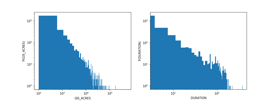
The raw wildfire dataset contained information about estimated fire sizes (GIS_ACRES = number of acres burned), and we augmented that dataset to add additional information about the temporal duration of fires. Histograms are a useful way of summarizing the distributions of fire sizes and durations. The pyplot module in matplotlib provides a function for plotting histograms (which uses the numpy histogram function to do the computation), as well as many other functions for configuring plot layouts, labels, etc. In the code below, we create a two-panel subplot to examine both the size and duration distributions.

Because the fire sizes and durations are spread out over a wide range of values, it is useful in this case to plot their distributions on a log-log scale (plt.loglog(). The fact that these histograms reveal an approximately linear relationship on a log-log scale indicates a power-law relationship in the distributions themselves. A power-law distribution of fire sizes has been investigated in simple models of forest fire dynamics.
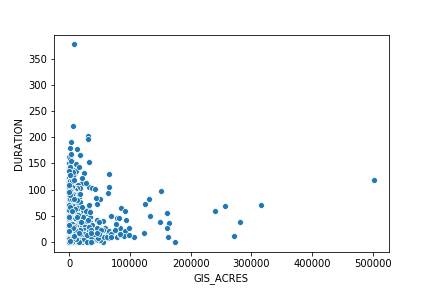
We might expect some sort of correlation between duration and size, i.e., that bigger fires should probably tend to last longer. We can take a look at their relationship with a scatter plot:

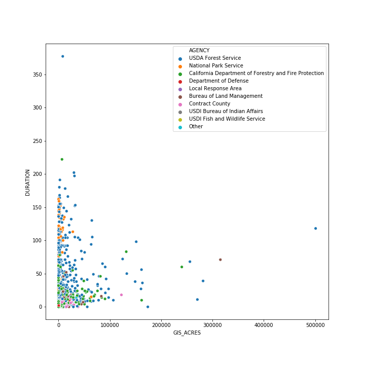
It's not obvious whether or not there is much correlation between size and duration in the historical data — we will revisit this question in Part 2 of the tutorial. For the meantime, however, we can get a bit more insight into the data by including a different layer of data in our plot. Specifically, we can repeat the scatter plot, but color each point for which AGENCY is responsible for dealing with the fire. The fact that fire sizes and durations seem to cluster somewhat based on the cognizant agency suggests that there may be different management practices or suppression policies used by different agencies that are contributing to some of the scatter in the data.

While we will not show examples here, we do want to point out the Seaborn provides a number of useful functions for summarizing data distributions.
Exercise: Are fires getting worse over time?
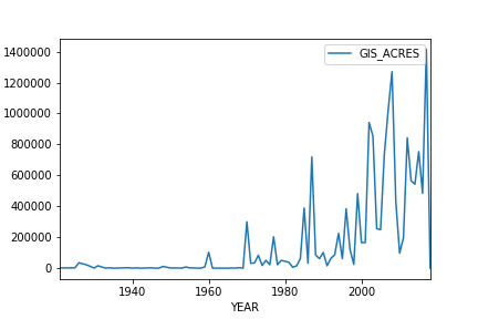
With this dataset, we can also examine changes in wildfire intensity over the years. If you'd like to get some additional hands-on experience with data processing and visualization, proceed to the Wildfire Jupyter notebook and work through the exercise at the end addressing this question about whether wildfires are getting worse over time. The plot that you end up making should look like the figure below.

CVW material development is supported by NSF OAC awards 1854828, 2321040, 2323116 (UT Austin) and 2005506 (Indiana University)