Histograms
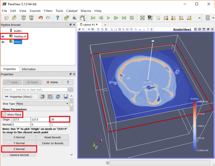
Continuing from the previous section, we want to inspect the head scan data in a slice plane at Z = 20 to find the density values for skin and bone. Let's set up a Slice filter to isolate the data of interest.
- Select the "headsq.vti" Source node in the Pipeline Browser and use Filters→Common→Slice to add a Slice filter to it.
- In the Properties panel, click "Z Normal" to choose an orientation perpendicular to the Z axis.
- Enter the Z location we found in the previous section (20) for the Z component of the Origin, then click "Apply".
The results will look very much like the Slice view we created in the previous section.

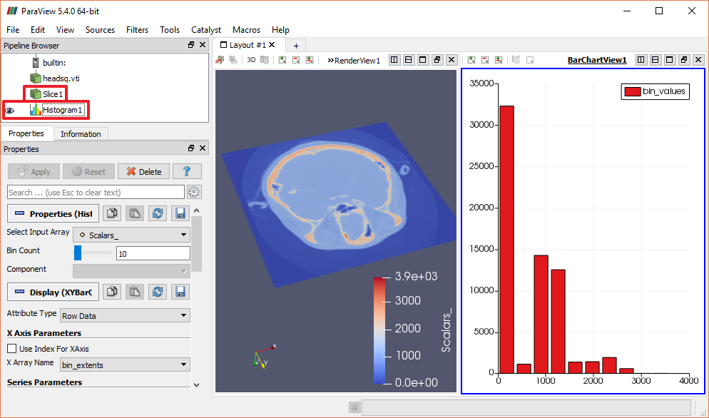
Now that we have isolated a nice subset of the data, let's learn more about what the data contains. To start, it would be good to understand the distribution of density values within the data. To do this, we will create a Histogram view, which displays a bar graph of scalar values in the data that is feeding into it.
- Uncheck "Show Plane" and hide the source node in the Pipeline Browser.
- Select the Slice node in the Pipeline Browser.
- Use Filters→Data Analysis→Histogram to add a Histogram filter.
- Click "Apply" in the Properties panel and see that ParaView opens up a new "Bar Chart" view in which to display the histogram data.

Notice that when the Bar Chart View is selected (it is outlined in blue), visibility icons are no longer shown next to the Source and Slice nodes in the Pipeline Browser. ParaView is protecting us from trying to display higher dimensioned data in inappapropriate lower dimensioned views. However, if you click where the visibility icon is normally seen, you will find that you can make those nodes visible, though the displayed data is hard to interpret.
Conversely, when the Render View is selected and no visibility icon is shown for the Histogram node, there truly is no way to show that data in the Render view. In this case there is no correspondence between the X and Y values in the Histogram and the 3D space of the Render View, so displaying the Histogram there makes no sense.
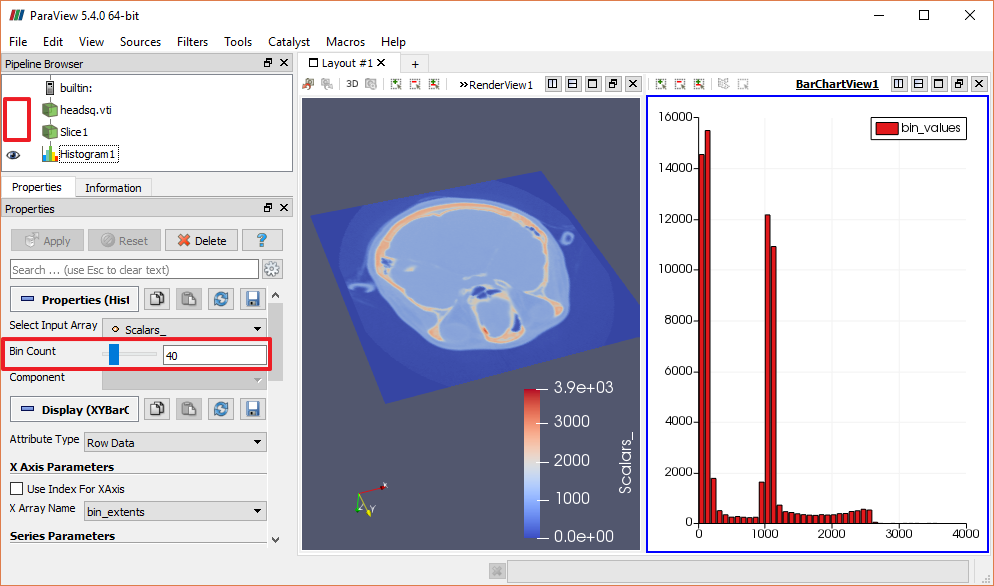
The default binning for the histogram (10) is a bit rough. For a more useful graph, change the Bin Count in the Properties Panel to a higher number (like 40), then click "Apply". It is now possible to learn some things from the data statistics.

By studying the histogram we can see that a large portion of the samples in this plane (those with densities under 200) effectively contain noise that doesn't interest us. Another large group of samples has density values around 1000, and we may well find our skin and bone voxels within that set of samples. Finally, though the data set contains a few samples with density values as high as 4000, we can see that the meaningful histogram data ends after a density of about 2600. Information like this can help you target your visualization parameters to focus on the most useful data ranges.
CVW material development is supported by NSF OAC awards 1854828, 2321040, 2323116 (UT Austin) and 2005506 (Indiana University)