Plot Over Line
Continuing from the previous section, we would like to refine our understanding of the data we are using. While the Histogram filter provided a overall summary of the density values in the data slice, we must use a different tool to determine which data values occur at specific samples. We will use the "Plot Over Line" filter to sample our data along a line.
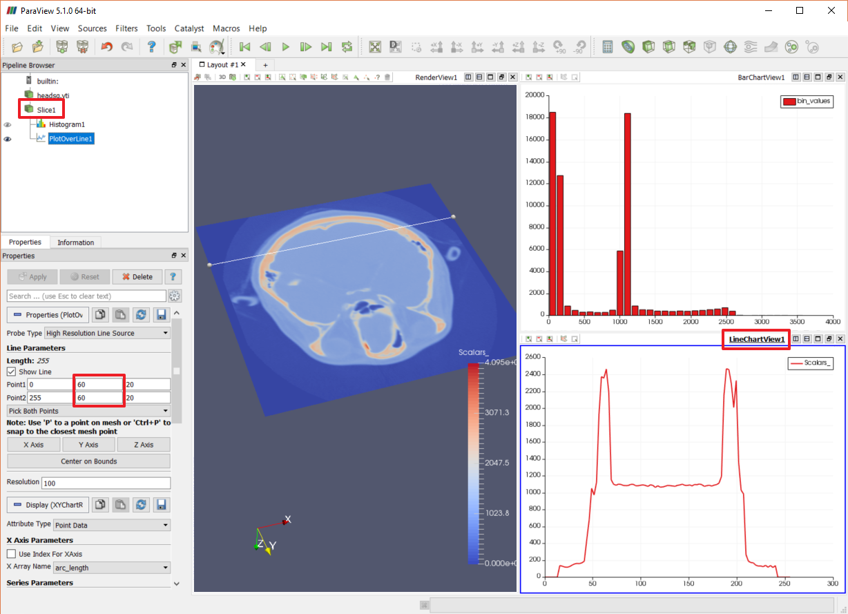
- Select the Slice node in the Pipeline Browser.
- Use Filters→Data Analysis→Plot Over Line to add a "Plot Over Line" filter.
- Click "Apply" in the Properties panel and see that ParaView opens up a new "Line Chart" view in which to display the histogram data.
- Select the Render view to cause the Plot Over Line filter's line to become visible.
- Change the line endpoints so it crosses nicely through the skull. In the Properties panel, set the Y value of both Point1 and Point2 to 60, then click "Apply".

We now have a line that is crossing the data in such a way that we can clearly see where it intersects both the skin samples and the bone samples. Looking at the Line Chart view we can see that the density values rise from 200 to about 1000 as they pass through the skin regions. Lets remember that a density value of 600 (right in the middle of the range) can be used to create a "skin" surface.
We can also see that as the line crosses the skull in two places it moves through densities between 1100 and 2300. Let's decide that the boundary of the bone is near the "outside" of those graph peaks and take note that a density value of 1200 can be used to create a "bone" surface.
Now that we've learned how statistical filters can help us collect information from the data, let's put what we've learned to use to complete this example and create the two isosurfaces.
- Close the two statistics views.
- delete the Histogram, PlotOverLine and Slice filters.
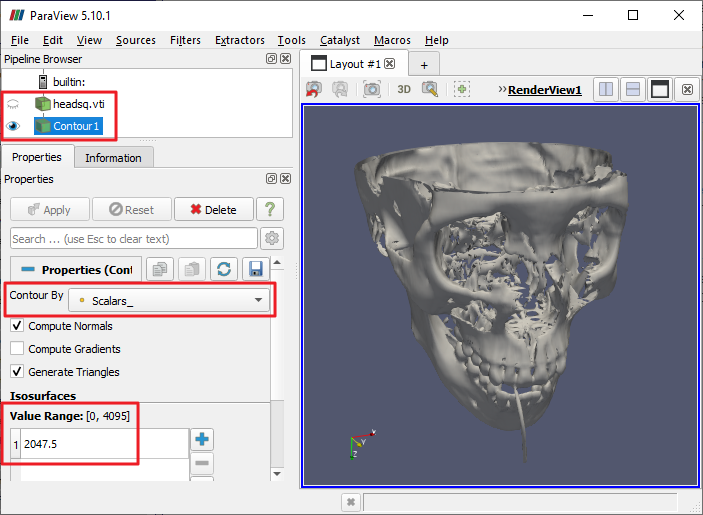
- Select the "headsq.vtk" source node and use Filters→Common→Contour to add a Contour filter to it, then click "Apply".
The Contour filter generates sets of triangles that pass through sample points having the same scalar values. In this case, the data set's "Scalars_" data array is used by default, which is what we want (it contains the densities). By default, a single contour is created at the midpoint of the data range.

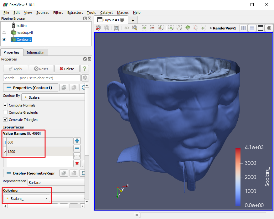
ParaView will remember scalar data (like the density values) at each of the vertices of the triangles that this filter produces. Now, edit the "Isosurfaces" list so it contains the numbers 600 and 1200, which we remember from our earlier study of the data set. Click "Apply" and the two surfaces we wanted should appear.
In the "Display" section, make sure the "Coloring" drop-down is set to "Scalars_" so that the scalar values are used to look up colors for the surfaces. By editing the color map, including its opacities, can you make the skin transparent and pink and the bone opaque and white? Don't forget to enable opacity mapping for surfaces in the color editor!

CVW material development is supported by NSF OAC awards 1854828, 2321040, 2323116 (UT Austin) and 2005506 (Indiana University)