Adding Glyphs
While applying a color map to a surface is useful for visualizing scalar values, it is not always helpful for visualizing vector data. We will now visualize vector data as 3D arrows that originate at some of the data points and are colored based on the scalar data values at those points. In ParaView, these arrows (and other such shapes) are called Glyphs.
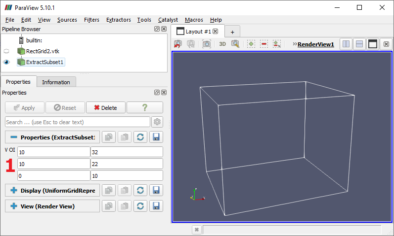
Continuing from the previous page, we are going to use an Extract Subset filter to focus on a portion of the data set where the vector field is most interesting.
- Delete the Contour node in the Pipeline Browser.
- Select the data source node and choose
Filters→Common→Extract Subset . - Set the "volume of interest" (VOI) of the subset (1) to be 10 to 32 in X, 10 to 22 in Y and 0 to 10 in Z.
- Click "Apply", hide the data source node and zoom in to the bounds of the extracted subset
-
With the ExtractSubset1 node selected,
choose
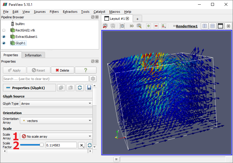
Filters→Common→Glyph . - Make the Glyph node visible.
- In the Properties, under Scale, set Scale Array (1) to "No scale array", which makes the arrows all have the same size. You can control that size by setting Scale Factor (2).
- If the "Jet" or "Turbo" color ramp from the previous page is not displayed, scroll to the Display properties, click the "Edit" button to show the color map editor, then find and select the "Jet" or "Turbo" map.
- Optionally, under Coloring, toggle the "Show/hide color legend" button to hide the color map legend.
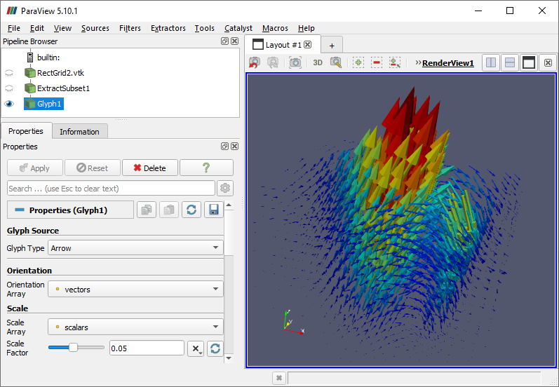
The default values for the Glyph filter do a pretty good job of placing arrows in the data set space, but the visualization can be improved. In this data set, the vector property is normalized so that all vectors have uniform length. The scalar property contains values that are independent of the vector data. In addition to controlling the arrow color, we can use the scalar property to control the arrow size.
- In the Scaling section, set the "Scale Factor" property to 0.05 and click "Apply" to make all the arrows smaller, reducing the clutter.
- Set the "Scale Array" property to "scalar" and click "Apply" to make the arrow sizes proportional to the scalar data values at the glyph locations.
- Toggle the data source node's visibility to hide the wire-frame box.
Depending on the data and visualization, it may be desirable to reduce or increase the number of glyphs by changing the "Maximum Number Of Sample Points". If things look good overall but a few glyphs are causing problems, try changing the "Seed" property that randomly selects which sample points are used for glyphs. These properties are found in the "Masking" section at the end of the Properties.
CVW material development is supported by NSF OAC awards 1854828, 2321040, 2323116 (UT Austin) and 2005506 (Indiana University)