Create a Visualization Pipeline
In this section we will explore the steps needed to produce a visualization. We will begin by importing some data into the current ParaView state. Next, we will apply some filters to derive additional data that can be rendered more effectively than the initial data set. Finally, we will investigate the use of color maps to highlight meaningful aspects of the data.
To begin, restart ParaView or select

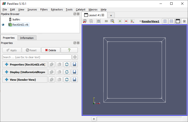
Some types of data are easier for ParaView to display than others. Think back to the cylinder from the first sections of the tutorial. It contained geometry that could easily be displayed on the screen without user involvement, so ParaView drew an acceptable default version of the cylinder. But what is the default way to render a rectangular volumetric data set? Does the user want to see what is inside it, or its surface, or a cross section of it? ParaView doesn't know, and decides to only show us its bounding box. In the coming sections we will explore various ways to view such data.
CVW material development is supported by NSF OAC awards 1854828, 2321040, 2323116 (UT Austin) and 2005506 (Indiana University)