Color Maps
Continuing from the previous page, we will now explore the use of color maps in visualizations. To start, right click on the Slice2 node and select Delete. We are now back to having a single Slice filter applied to the data grid.
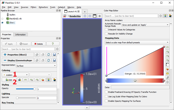
Expand the Display section of the Properties panel. The Coloring dropdown (1) tells us that the rendered image we see is the result of using the "scalars" data values within the slice to look up colors from the blue-to-white-to-red ramp shown in the rendered image. Click the "Edit" button (2) to bring up the Color Map Editor, which will allow us to alter the way the values are mapped to colors.

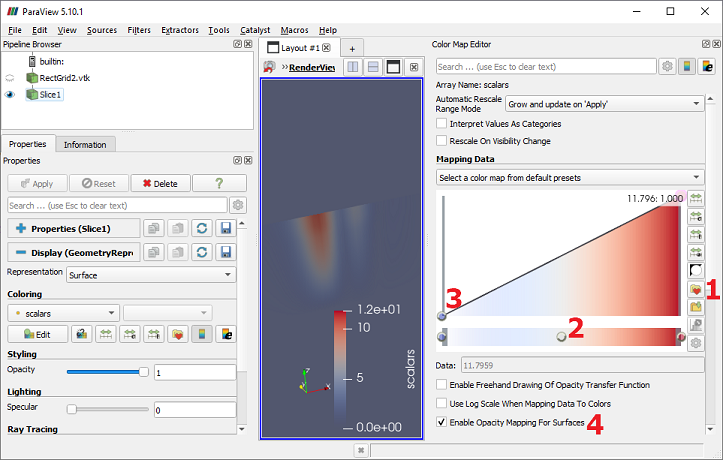
The Color Map Editor allows you to load a preset color map using the "Load Preset" button (1). You can also edit the current map and optionally save it as a preset. The current color map has three colors assigned, each represented by a circle on the bottom of the Mapping Data graph (2). The color blue maps to the lowest data value, white to a value in the middle of the range, and red to the highest data value. This ramp also has an opacity specification that is currently being ignored. It is specified by the heights of the circles in the upper part of Mapping Data (3). Check the "Enable opacity mapping for surfaces" box (4). Notice how large portions of the slice are now transparent.

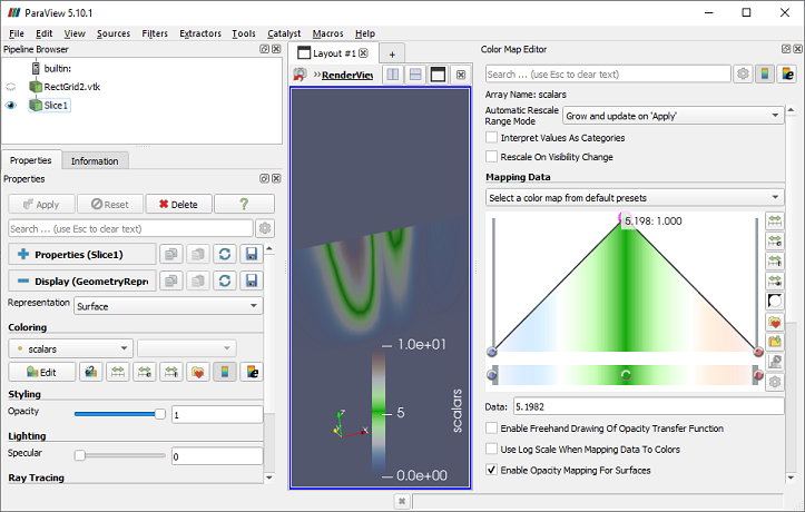
You can edit the color and opacity ramps in many ways. Single-click on a color circle to type a new data value for it. Double-click on a color circle to select a new color for it. Click an existing opacity circle to drag it up or down to change the opacity. Click in an empty area on the color or opacity sections to add a new circle. Select a circle and press the Delete key to remove it. Let's test these abilities by doing the following:
- Double-click the center color circle and set its color to bright green.
- Click the opacity ramp above the new "green" circle and drag it to the top of the graph.
- Drag the right-most "red" opacity circle to the bottom of the graph.

CVW material development is supported by NSF OAC awards 1854828, 2321040, 2323116 (UT Austin) and 2005506 (Indiana University)